2019-09-20 19:15:31 +02:00
|
|
|
//! Create choices using radio buttons.
|
2021-10-20 19:07:09 +07:00
|
|
|
use crate::alignment;
|
2020-11-12 00:09:52 +01:00
|
|
|
use crate::event::{self, Event};
|
2021-09-20 15:09:55 +07:00
|
|
|
use crate::layout;
|
2020-11-12 00:09:52 +01:00
|
|
|
use crate::mouse;
|
2021-10-18 15:19:04 +07:00
|
|
|
use crate::renderer;
|
2021-10-31 16:13:03 +07:00
|
|
|
use crate::text;
|
2020-12-15 06:38:46 +01:00
|
|
|
use crate::touch;
|
2021-10-31 16:13:03 +07:00
|
|
|
use crate::widget::{self, Row, Text};
|
2019-11-21 13:47:20 +01:00
|
|
|
use crate::{
|
2022-02-22 14:10:49 +07:00
|
|
|
Alignment, Clipboard, Color, Element, Layout, Length, Point, Rectangle,
|
|
|
|
|
Shell, Widget,
|
2019-11-21 13:47:20 +01:00
|
|
|
};
|
2019-09-20 19:15:31 +02:00
|
|
|
|
2022-05-27 01:26:57 +02:00
|
|
|
pub use iced_style::radio::{Appearance, StyleSheet};
|
2021-10-20 19:06:53 +07:00
|
|
|
|
2019-11-21 13:47:20 +01:00
|
|
|
/// A circular button representing a choice.
|
|
|
|
|
///
|
|
|
|
|
/// # Example
|
|
|
|
|
/// ```
|
2022-05-27 01:26:57 +02:00
|
|
|
/// # type Radio<Message> =
|
|
|
|
|
/// # iced_native::widget::Radio<Message, iced_native::renderer::Null>;
|
2019-11-24 10:44:55 +01:00
|
|
|
/// #
|
2019-11-21 13:47:20 +01:00
|
|
|
/// #[derive(Debug, Clone, Copy, PartialEq, Eq)]
|
|
|
|
|
/// pub enum Choice {
|
|
|
|
|
/// A,
|
|
|
|
|
/// B,
|
|
|
|
|
/// }
|
|
|
|
|
///
|
|
|
|
|
/// #[derive(Debug, Clone, Copy)]
|
|
|
|
|
/// pub enum Message {
|
|
|
|
|
/// RadioSelected(Choice),
|
|
|
|
|
/// }
|
|
|
|
|
///
|
|
|
|
|
/// let selected_choice = Some(Choice::A);
|
|
|
|
|
///
|
|
|
|
|
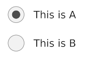
/// Radio::new(Choice::A, "This is A", selected_choice, Message::RadioSelected);
|
|
|
|
|
///
|
|
|
|
|
/// Radio::new(Choice::B, "This is B", selected_choice, Message::RadioSelected);
|
|
|
|
|
/// ```
|
|
|
|
|
///
|
2021-12-23 09:34:37 +02:00
|
|
|
/// 
|
2019-11-22 21:16:40 +01:00
|
|
|
#[allow(missing_debug_implementations)]
|
2022-05-27 01:26:57 +02:00
|
|
|
pub struct Radio<Message, Renderer>
|
|
|
|
|
where
|
|
|
|
|
Renderer: text::Renderer,
|
|
|
|
|
Renderer::Theme: StyleSheet,
|
|
|
|
|
{
|
2019-11-21 13:47:20 +01:00
|
|
|
is_selected: bool,
|
|
|
|
|
on_click: Message,
|
|
|
|
|
label: String,
|
2020-05-15 11:27:24 +09:00
|
|
|
width: Length,
|
|
|
|
|
size: u16,
|
|
|
|
|
spacing: u16,
|
2020-06-19 00:08:28 +02:00
|
|
|
text_size: Option<u16>,
|
2021-05-17 14:22:55 +01:00
|
|
|
font: Renderer::Font,
|
2022-05-27 01:26:57 +02:00
|
|
|
style: <Renderer::Theme as StyleSheet>::Style,
|
2019-11-21 13:47:20 +01:00
|
|
|
}
|
|
|
|
|
|
2022-05-27 01:26:57 +02:00
|
|
|
impl<Message, Renderer> Radio<Message, Renderer>
|
2020-10-17 08:10:30 +02:00
|
|
|
where
|
|
|
|
|
Message: Clone,
|
2022-05-27 01:26:57 +02:00
|
|
|
Renderer: text::Renderer,
|
|
|
|
|
Renderer::Theme: StyleSheet,
|
2020-05-15 11:27:24 +09:00
|
|
|
{
|
2021-10-20 19:06:53 +07:00
|
|
|
/// The default size of a [`Radio`] button.
|
|
|
|
|
pub const DEFAULT_SIZE: u16 = 28;
|
|
|
|
|
|
|
|
|
|
/// The default spacing of a [`Radio`] button.
|
|
|
|
|
pub const DEFAULT_SPACING: u16 = 15;
|
|
|
|
|
|
2019-11-21 13:47:20 +01:00
|
|
|
/// Creates a new [`Radio`] button.
|
|
|
|
|
///
|
|
|
|
|
/// It expects:
|
|
|
|
|
/// * the value related to the [`Radio`] button
|
|
|
|
|
/// * the label of the [`Radio`] button
|
|
|
|
|
/// * the current selected value
|
|
|
|
|
/// * a function that will be called when the [`Radio`] is selected. It
|
|
|
|
|
/// receives the value of the radio and must produce a `Message`.
|
2020-04-05 10:29:25 +07:00
|
|
|
pub fn new<F, V>(
|
|
|
|
|
value: V,
|
|
|
|
|
label: impl Into<String>,
|
|
|
|
|
selected: Option<V>,
|
|
|
|
|
f: F,
|
|
|
|
|
) -> Self
|
2019-11-21 13:47:20 +01:00
|
|
|
where
|
|
|
|
|
V: Eq + Copy,
|
2022-02-13 22:13:47 +07:00
|
|
|
F: FnOnce(V) -> Message,
|
2019-11-21 13:47:20 +01:00
|
|
|
{
|
|
|
|
|
Radio {
|
|
|
|
|
is_selected: Some(value) == selected,
|
|
|
|
|
on_click: f(value),
|
2020-04-05 10:29:25 +07:00
|
|
|
label: label.into(),
|
2020-05-15 11:27:24 +09:00
|
|
|
width: Length::Shrink,
|
2021-10-20 19:06:53 +07:00
|
|
|
size: Self::DEFAULT_SIZE,
|
|
|
|
|
spacing: Self::DEFAULT_SPACING, //15
|
2020-06-19 00:08:28 +02:00
|
|
|
text_size: None,
|
2021-05-17 14:22:55 +01:00
|
|
|
font: Default::default(),
|
2022-05-27 01:26:57 +02:00
|
|
|
style: Default::default(),
|
2019-11-21 13:47:20 +01:00
|
|
|
}
|
|
|
|
|
}
|
|
|
|
|
|
2020-05-15 11:27:24 +09:00
|
|
|
/// Sets the size of the [`Radio`] button.
|
|
|
|
|
pub fn size(mut self, size: u16) -> Self {
|
|
|
|
|
self.size = size;
|
|
|
|
|
self
|
|
|
|
|
}
|
|
|
|
|
|
|
|
|
|
/// Sets the width of the [`Radio`] button.
|
|
|
|
|
pub fn width(mut self, width: Length) -> Self {
|
|
|
|
|
self.width = width;
|
|
|
|
|
self
|
|
|
|
|
}
|
|
|
|
|
|
|
|
|
|
/// Sets the spacing between the [`Radio`] button and the text.
|
|
|
|
|
pub fn spacing(mut self, spacing: u16) -> Self {
|
|
|
|
|
self.spacing = spacing;
|
|
|
|
|
self
|
|
|
|
|
}
|
|
|
|
|
|
|
|
|
|
/// Sets the text size of the [`Radio`] button.
|
|
|
|
|
pub fn text_size(mut self, text_size: u16) -> Self {
|
2020-06-19 00:08:28 +02:00
|
|
|
self.text_size = Some(text_size);
|
2020-05-15 11:27:24 +09:00
|
|
|
self
|
|
|
|
|
}
|
|
|
|
|
|
2021-05-17 14:22:55 +01:00
|
|
|
/// Sets the text font of the [`Radio`] button.
|
|
|
|
|
pub fn font(mut self, font: Renderer::Font) -> Self {
|
|
|
|
|
self.font = font;
|
|
|
|
|
self
|
|
|
|
|
}
|
|
|
|
|
|
2020-01-07 02:25:57 +01:00
|
|
|
/// Sets the style of the [`Radio`] button.
|
2021-10-31 17:14:10 +07:00
|
|
|
pub fn style(
|
|
|
|
|
mut self,
|
2022-05-27 01:26:57 +02:00
|
|
|
style: impl Into<<Renderer::Theme as StyleSheet>::Style>,
|
2021-10-31 17:14:10 +07:00
|
|
|
) -> Self {
|
2022-05-27 01:26:57 +02:00
|
|
|
self.style = style.into();
|
2019-11-21 13:47:20 +01:00
|
|
|
self
|
|
|
|
|
}
|
|
|
|
|
}
|
2019-09-20 19:15:31 +02:00
|
|
|
|
2022-05-27 01:26:57 +02:00
|
|
|
impl<Message, Renderer> Widget<Message, Renderer> for Radio<Message, Renderer>
|
2019-09-20 19:15:31 +02:00
|
|
|
where
|
2019-11-21 13:47:20 +01:00
|
|
|
Message: Clone,
|
2021-10-31 16:13:03 +07:00
|
|
|
Renderer: text::Renderer,
|
2022-05-27 01:26:57 +02:00
|
|
|
Renderer::Theme: StyleSheet,
|
2019-09-20 19:15:31 +02:00
|
|
|
{
|
2019-11-10 06:05:20 +01:00
|
|
|
fn width(&self) -> Length {
|
2020-05-15 11:27:24 +09:00
|
|
|
self.width
|
2019-11-10 06:05:20 +01:00
|
|
|
}
|
|
|
|
|
|
2019-11-16 22:08:49 +01:00
|
|
|
fn height(&self) -> Length {
|
|
|
|
|
Length::Shrink
|
|
|
|
|
}
|
|
|
|
|
|
2019-11-10 06:05:20 +01:00
|
|
|
fn layout(
|
|
|
|
|
&self,
|
|
|
|
|
renderer: &Renderer,
|
|
|
|
|
limits: &layout::Limits,
|
|
|
|
|
) -> layout::Node {
|
2019-11-21 13:47:20 +01:00
|
|
|
Row::<(), Renderer>::new()
|
2020-05-15 11:27:24 +09:00
|
|
|
.width(self.width)
|
|
|
|
|
.spacing(self.spacing)
|
2021-09-20 15:09:55 +07:00
|
|
|
.align_items(Alignment::Center)
|
2019-11-21 13:47:20 +01:00
|
|
|
.push(
|
|
|
|
|
Row::new()
|
2020-05-15 11:27:24 +09:00
|
|
|
.width(Length::Units(self.size))
|
|
|
|
|
.height(Length::Units(self.size)),
|
|
|
|
|
)
|
|
|
|
|
.push(
|
|
|
|
|
Text::new(&self.label)
|
|
|
|
|
.width(self.width)
|
2020-06-19 00:08:28 +02:00
|
|
|
.size(self.text_size.unwrap_or(renderer.default_size())),
|
2019-11-21 13:47:20 +01:00
|
|
|
)
|
|
|
|
|
.layout(renderer, limits)
|
2019-09-20 19:15:31 +02:00
|
|
|
}
|
|
|
|
|
|
|
|
|
|
fn on_event(
|
|
|
|
|
&mut self,
|
|
|
|
|
event: Event,
|
2019-11-10 06:05:20 +01:00
|
|
|
layout: Layout<'_>,
|
2019-09-20 19:15:31 +02:00
|
|
|
cursor_position: Point,
|
2019-10-29 03:34:21 +01:00
|
|
|
_renderer: &Renderer,
|
2021-03-10 01:59:02 +01:00
|
|
|
_clipboard: &mut dyn Clipboard,
|
2021-11-29 16:22:01 +07:00
|
|
|
shell: &mut Shell<'_, Message>,
|
2020-11-12 00:09:52 +01:00
|
|
|
) -> event::Status {
|
2019-09-20 19:15:31 +02:00
|
|
|
match event {
|
2020-12-15 06:13:19 +01:00
|
|
|
Event::Mouse(mouse::Event::ButtonPressed(mouse::Button::Left))
|
2020-12-15 06:38:46 +01:00
|
|
|
| Event::Touch(touch::Event::FingerPressed { .. }) => {
|
2019-09-20 19:15:31 +02:00
|
|
|
if layout.bounds().contains(cursor_position) {
|
2021-11-29 16:22:01 +07:00
|
|
|
shell.publish(self.on_click.clone());
|
2020-11-12 00:47:58 +01:00
|
|
|
|
|
|
|
|
return event::Status::Captured;
|
2019-09-20 19:15:31 +02:00
|
|
|
}
|
|
|
|
|
}
|
|
|
|
|
_ => {}
|
|
|
|
|
}
|
2020-11-12 00:09:52 +01:00
|
|
|
|
|
|
|
|
event::Status::Ignored
|
2019-09-20 19:15:31 +02:00
|
|
|
}
|
|
|
|
|
|
2021-10-20 19:08:13 +07:00
|
|
|
fn mouse_interaction(
|
|
|
|
|
&self,
|
|
|
|
|
layout: Layout<'_>,
|
|
|
|
|
cursor_position: Point,
|
2021-11-02 15:03:29 +07:00
|
|
|
_viewport: &Rectangle,
|
2022-01-11 14:12:28 +07:00
|
|
|
_renderer: &Renderer,
|
2021-10-20 19:08:13 +07:00
|
|
|
) -> mouse::Interaction {
|
|
|
|
|
if layout.bounds().contains(cursor_position) {
|
|
|
|
|
mouse::Interaction::Pointer
|
|
|
|
|
} else {
|
|
|
|
|
mouse::Interaction::default()
|
|
|
|
|
}
|
|
|
|
|
}
|
|
|
|
|
|
2019-09-20 19:15:31 +02:00
|
|
|
fn draw(
|
|
|
|
|
&self,
|
|
|
|
|
renderer: &mut Renderer,
|
2022-05-14 01:47:55 +02:00
|
|
|
theme: &Renderer::Theme,
|
2021-10-18 15:19:04 +07:00
|
|
|
style: &renderer::Style,
|
2019-11-10 06:05:20 +01:00
|
|
|
layout: Layout<'_>,
|
2019-09-20 19:15:31 +02:00
|
|
|
cursor_position: Point,
|
2020-08-18 03:37:32 +02:00
|
|
|
_viewport: &Rectangle,
|
2021-10-14 16:07:22 +07:00
|
|
|
) {
|
2021-10-20 19:07:09 +07:00
|
|
|
let bounds = layout.bounds();
|
|
|
|
|
let is_mouse_over = bounds.contains(cursor_position);
|
|
|
|
|
|
|
|
|
|
let mut children = layout.children();
|
|
|
|
|
|
2022-01-20 18:34:15 +07:00
|
|
|
let custom_style = if is_mouse_over {
|
2022-05-27 01:26:57 +02:00
|
|
|
theme.hovered(self.style)
|
2022-01-20 18:34:15 +07:00
|
|
|
} else {
|
2022-05-27 01:26:57 +02:00
|
|
|
theme.active(self.style)
|
2022-01-20 18:34:15 +07:00
|
|
|
};
|
|
|
|
|
|
2021-10-20 19:07:09 +07:00
|
|
|
{
|
|
|
|
|
let layout = children.next().unwrap();
|
|
|
|
|
let bounds = layout.bounds();
|
|
|
|
|
|
|
|
|
|
let size = bounds.width;
|
|
|
|
|
let dot_size = size / 2.0;
|
|
|
|
|
|
2021-11-04 19:22:29 +07:00
|
|
|
renderer.fill_quad(
|
|
|
|
|
renderer::Quad {
|
|
|
|
|
bounds,
|
|
|
|
|
border_radius: size / 2.0,
|
2022-01-20 18:34:15 +07:00
|
|
|
border_width: custom_style.border_width,
|
|
|
|
|
border_color: custom_style.border_color,
|
2021-11-04 19:22:29 +07:00
|
|
|
},
|
2022-01-20 18:34:15 +07:00
|
|
|
custom_style.background,
|
2021-11-04 19:22:29 +07:00
|
|
|
);
|
2021-10-20 19:07:09 +07:00
|
|
|
|
|
|
|
|
if self.is_selected {
|
2021-11-04 19:22:29 +07:00
|
|
|
renderer.fill_quad(
|
|
|
|
|
renderer::Quad {
|
|
|
|
|
bounds: Rectangle {
|
|
|
|
|
x: bounds.x + dot_size / 2.0,
|
|
|
|
|
y: bounds.y + dot_size / 2.0,
|
|
|
|
|
width: bounds.width - dot_size,
|
|
|
|
|
height: bounds.height - dot_size,
|
|
|
|
|
},
|
|
|
|
|
border_radius: dot_size / 2.0,
|
|
|
|
|
border_width: 0.0,
|
|
|
|
|
border_color: Color::TRANSPARENT,
|
2021-10-20 19:07:09 +07:00
|
|
|
},
|
2022-01-20 18:34:15 +07:00
|
|
|
custom_style.dot_color,
|
2021-11-04 19:22:29 +07:00
|
|
|
);
|
2021-10-20 19:07:09 +07:00
|
|
|
}
|
|
|
|
|
}
|
|
|
|
|
|
|
|
|
|
{
|
|
|
|
|
let label_layout = children.next().unwrap();
|
|
|
|
|
|
2021-10-31 16:13:03 +07:00
|
|
|
widget::text::draw(
|
2021-10-20 19:07:09 +07:00
|
|
|
renderer,
|
|
|
|
|
style,
|
|
|
|
|
label_layout,
|
|
|
|
|
&self.label,
|
2021-12-10 22:53:00 +01:00
|
|
|
self.font.clone(),
|
2021-10-20 19:07:09 +07:00
|
|
|
self.text_size,
|
2022-01-20 18:34:15 +07:00
|
|
|
custom_style.text_color,
|
2021-10-20 19:07:09 +07:00
|
|
|
alignment::Horizontal::Left,
|
|
|
|
|
alignment::Vertical::Center,
|
|
|
|
|
);
|
|
|
|
|
}
|
2019-09-20 19:15:31 +02:00
|
|
|
}
|
|
|
|
|
}
|
|
|
|
|
|
2022-05-27 01:26:57 +02:00
|
|
|
impl<'a, Message, Renderer> From<Radio<Message, Renderer>>
|
2019-09-20 19:15:31 +02:00
|
|
|
for Element<'a, Message, Renderer>
|
|
|
|
|
where
|
2020-03-30 06:30:22 +08:00
|
|
|
Message: 'a + Clone,
|
2021-10-31 16:13:03 +07:00
|
|
|
Renderer: 'a + text::Renderer,
|
2022-05-27 01:26:57 +02:00
|
|
|
Renderer::Theme: StyleSheet,
|
2019-09-20 19:15:31 +02:00
|
|
|
{
|
2022-05-27 01:26:57 +02:00
|
|
|
fn from(radio: Radio<Message, Renderer>) -> Element<'a, Message, Renderer> {
|
2019-11-21 13:47:20 +01:00
|
|
|
Element::new(radio)
|
2019-09-20 19:15:31 +02:00
|
|
|
}
|
|
|
|
|
}
|